
Improving Ecommerce Conversion Rates Without Losing Your Mind
Let's be real—your shirts are hilarious, so why are your shopping carts getting abandoned more often than a New Year's resolution? If you're seeing more ghosting than a dating app, you're not alone. The secret to a killer conversion rate isn't some complex marketing voodoo; it's about turning your store from a confusing maze into a place where buying is a no-brainer.
Why Your Carts Are Fuller Than Your Bank Account
So, you’ve got a store full of awesome products—maybe some funny t-shirts that perfectly nail the chaos of mom life or novelty tees that speak to the soul. People are visiting, they’re clicking around, and they’re even adding stuff to their cart.
But then… crickets. The sale vanishes into thin air, leaving you wondering what the heck went wrong.
If this sounds familiar, welcome to the club. It's the classic online store problem: plenty of window shoppers, not enough actual buyers. You're not just imagining it; turning visitors into paying customers is the hardest part of the game.
What’s a Good Conversion Rate, Anyway?
It’s easy to get discouraged and assume everyone else is crushing it, but the real numbers might surprise you. As of 2025, the global average ecommerce conversion rate hovers somewhere between 2% and 4%.
For industries like fashion and apparel, that number often dips even lower to around 1.9%, mostly because people take more time to browse and compare options before pulling the trigger. So, if your store is converting at 2%, you're technically doing okay—but "okay" doesn't pay the bills. If you want to get nerdy, you can dive deeper into these industry benchmarks to see how you really stack up.
Let's be real: "average" is just a polite word for "meh." You didn't start a business to be average. You started it to sell awesome stuff and maybe, just maybe, afford that fancy coffee every once in a while.
The goal isn't just to meet the average; it's to blow it out of the water. Improving your conversion rate means plugging the leaks in your sales funnel and making it ridiculously easy for people to say "yes." It's about tweaking the small things that end up making a massive difference.
We’re talking about fixing all those little annoyances that make a potential customer sigh, close the tab, and go back to scrolling through cat videos.
This guide is your roadmap to doing just that. We'll skip the corporate jargon and get straight to the actionable stuff that turns those "I'll come back later" visitors into "take my money now" fans. We’ll cover the biggest conversion killers and show you how to fix them, starting with the quickest wins to stop shoppers from bouncing for good.
Before we dive into the deep end, let's talk about the low-hanging fruit. These are the most common reasons shoppers leave, and thankfully, they're often the easiest to fix.
Quick Fixes to Stop Customers From Bouncing
| Conversion Killer | The Easy Fix |
|---|---|
| Surprise Shipping Costs | Be upfront about shipping fees. Better yet, offer free shipping over a certain order value—it’s a huge incentive. |
| Forcing Account Creation | Always offer a guest checkout option. No one wants to create another password they’ll just forget. |
| A Confusing Checkout Process | Simplify it. Get rid of unnecessary fields and make the steps crystal clear. Think one-page checkout. |
| Slow Site Speed | Compress your images and use a reliable host. A site that takes forever to load is a guaranteed sale-killer. |
| Not Looking Trustworthy | Add customer reviews, trust badges (like secure payment icons), and a clear return policy. Make people feel safe. |
Fixing even one or two of these issues can give you an immediate boost. Now, let's get into the nitty-gritty of optimizing your store from top to bottom.
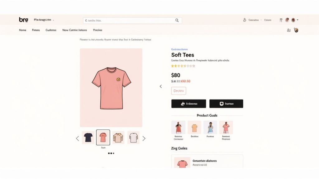
Crafting Product Pages That Actually Sell
Alright, let's get real about your product pages. Think of them as your store's digital salespeople. Are they charming and persuasive, or are they just standing there, mumbling about fabric content? It's time to turn them into your star employees.
Your product page is where the magic is supposed to happen. It’s the final pitch before a customer hits "Add to Cart" or bounces forever. You can have the best ads on the internet, but if this page drops the ball, the sale is dead. Every time.
Write Descriptions That Don't Suck
Nobody wants to read a boring, robotic list of features. "100% cotton, pre-shrunk, side-seamed." Snooze. Your product descriptions need to be funnier than your uncle's best dad joke and more convincing than a toddler who wants ice cream.
This is your shot to inject your brand's personality directly into the shopping cart. Don't just list what the shirt is—tell them what it does. A "Mom Life" shirt isn't just fabric; it's a badge of honor for surviving another day fueled by chaos and cold coffee. Sell the feeling. Sell the laugh. Sell the knowing nod you get from another parent in the grocery store aisle.
The goal isn't just to describe the shirt. It's to make your customer feel like they're already in on the joke. Make them nod and say, "Yep, that's me."
We've all seen those product pages that are just a wall of text. Don't be that person. Use short, punchy sentences and bullet points to hit the highlights. For a deeper dive, our guide on how to write product descriptions that sell will help you turn your words into conversion machines.
Show It Off With Killer Photos
Online shoppers can't touch or feel your tees, so your photos have to do all the heavy lifting. Grainy, poorly lit pictures from your 2012 smartphone aren't going to cut it. Let’s be clear: high-quality images are non-negotiable.
You're selling ridiculously soft, comfy shirts. Your photos need to scream "comfort."
Here’s how to make your visuals work harder for you:
- Lifestyle Shots: Show real people wearing your shirts out in the wild. Let customers see how that tee looks on someone who isn't a professional mannequin.
- Multiple Angles: Give them the full picture—front, back, and a close-up of the design. Let them see the print quality and fabric texture.
- Zoom, Baby, Zoom: Make sure your images are high-res enough that customers can zoom in without it turning into a pixelated mess.
- Video & GIFs: A short video of someone laughing or moving in the tee adds a dynamic element that static photos just can't capture.
Make Sizing Stupidly Simple
"What size should I get?" That question is a notorious conversion killer. Sizing anxiety is real. If a customer is unsure, they’re far more likely to leave than risk ordering the wrong thing and dealing with returns. A dead-simple size guide is your best defense.
Don't just upload a generic manufacturer's chart and call it a day. Create a simple, visual guide that actually makes sense.
Here's what it should include:
- Clear Measurements: Provide chest and length measurements in both inches and centimeters.
- Model Info: Show a model wearing a specific size and list their height and weight. This provides a real-world reference point that is incredibly helpful.
- Fit Description: Is it a relaxed fit? Slim fit? True to size? Use simple terms to describe how the shirt is meant to feel.
When you remove the guesswork, you remove a major barrier to purchase. The goal is to make a customer so confident in their choice that clicking "Add to Cart" feels like the only logical next step.
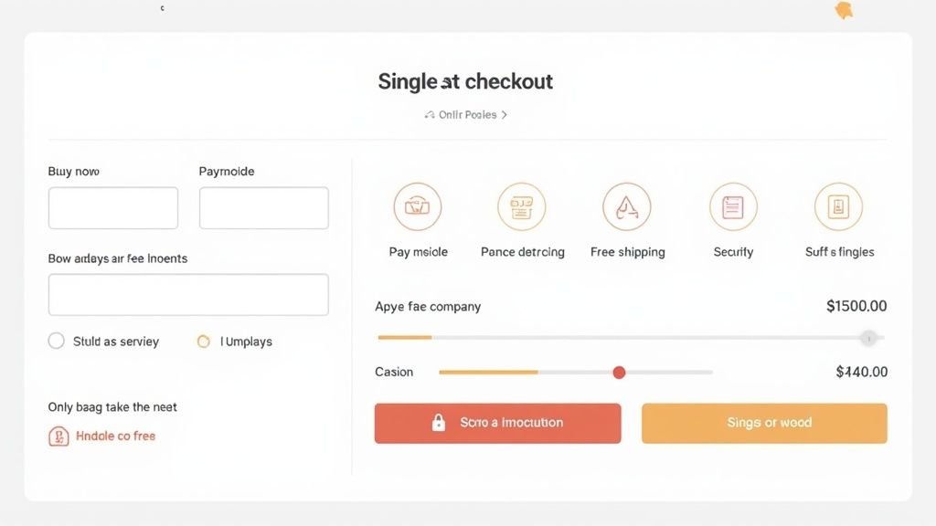
Making Checkout Smoother Than a Fresh Jar of Peanut Butter
You did it. You wooed them with a hilarious product description, dazzled them with gorgeous photos, and convinced them they absolutely need that novelty tee. They triumphantly click "Add to Cart," and you’re inches from the finish line.
And then… disaster strikes. The checkout process. This is where good intentions go to die. One confusing step, one unexpected shipping fee, and POOF—they’re gone, faster than the last slice of pizza at a party.
Let’s be real, a clunky checkout is the ultimate conversion killer. If buying from you feels like doing your taxes, you've already lost. We need to make this process so simple and painless that customers barely even notice they’ve spent money.
Ditch the Forced Commitment
First things first: stop forcing people to create an account. Nobody—and I mean nobody—wants to create yet another password they'll immediately forget. Requiring an account before purchase is like asking for a marriage commitment on the first date. It’s too much, too soon.
Always, always offer a guest checkout option. Let them give you their money with as few barriers as possible. You can always ask them to create an account on the confirmation page after the sale is locked in.
Think of it this way: your customer is on a mission to get a funny t-shirt. Don't send them on a side quest to remember their mother's maiden name and the name of their first pet.
Payment Options for Everyone
The year is no longer 1998. People expect options. While Visa and Mastercard are staples, adding express payment methods like Apple Pay, Google Pay, and PayPal is a game-changer. These options let impulse buyers complete their purchase in seconds with a fingerprint or a face scan.
You're removing the friction of having to go find a wallet and manually type in 16 digits. The easier it is to pay, the more likely they are to do it.
No More Nasty Surprises
The number one reason for cart abandonment? Unexpected costs. That surprise shipping fee that only appears at the very last second is pure poison for your conversion rate.
Be upfront and transparent about all costs. Here’s how:
- Display a Shipping Estimator: Let them see the shipping cost right in the cart, not five steps later.
- Offer Free Shipping: This is the holy grail. We offer free shipping because we know it’s a huge deal. You can find all the details on our shipping info page.
- Use a Progress Bar: If you offer free shipping over a certain amount, a little bar that says "You're only $10 away from free shipping!" works wonders.
In the competitive world of fashion, where cart abandonment rates can soar past 70%, a streamlined checkout is one of the most powerful tools for improving ecommerce conversion rates. As online shopping continues to grow, nailing these details is what separates the winners from the stores with overflowing abandoned carts. You can learn more about these ecommerce benchmarks to get a closer look at the data behind these trends.
Keep It Simple, Seriously
Your checkout page should have one job: taking the customer's money. Don't distract them with pop-ups, related products, or links to your blog. A clean, single-page checkout is often your best friend.
Strip it down to the bare essentials. Name, address, payment. That’s it. Every extra field you ask them to fill out is another chance for them to get frustrated and leave. Make the entire experience feel secure, straightforward, and speedy, so hitting 'Confirm Order' is a satisfying tap, not a leap of faith.
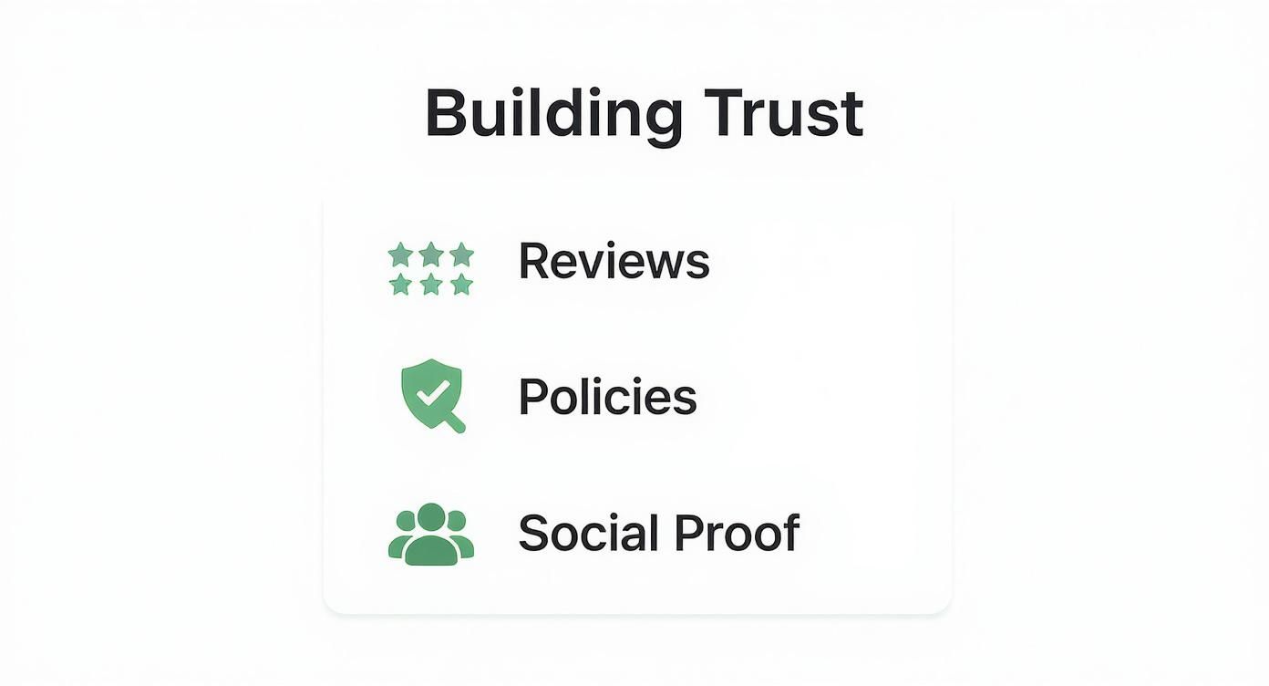
Building Trust Faster Than a Rumor in a Small Town
Let's be real: on the internet, everyone's a skeptic. Your customers have their credit cards clutched tight, ready to bolt at the first sign of anything sketchy. Before they'll hand over their hard-earned cash for one of our hilarious novelty tees, they need to know you're the real deal.
Building trust is like making a good first impression—you only get one shot. A huge chunk of improving your conversion rate boils down to one simple question: do they trust you? If the answer is no, that sale is dead on arrival.
Show Off Your Happy Customers
Nothing screams "we're legit" louder than seeing real people absolutely loving your products. This is social proof in action. It’s the digital version of seeing a long line outside a restaurant—you immediately think, "Wow, that place must be good."
Here’s how to harness the power of your existing fans:
- Encourage User-Generated Content (UGC): Ask customers to tag you on Instagram wearing their new favorite funny t-shirts. Feature those photos on your product pages and social media feeds. It’s authentic, it's powerful, and it’s basically free marketing.
- Showcase Real, Unfiltered Reviews: Don't just show the five-star raves (though those are awesome). A mix of reviews, even ones that mention a minor issue you quickly fixed, feels way more genuine. It shows you're a real business that actually listens.
This kind of authentic proof tells new visitors that buying from you isn't a gamble; it's a guaranteed win.
Your Policies Shouldn't Require a Law Degree
Is your return policy buried three clicks deep and written in confusing legal jargon? If so, you're scaring people away. A clear, easy-to-find, and customer-friendly return policy is one of the most powerful trust signals you can have.
Think about it from their side. They're worried about getting the wrong size or not loving the design once it's in their hands. A "no questions asked" return policy completely removes that risk, making it a hell of a lot easier for them to click "buy."
Your return policy isn't just a boring legal page; it's a promise. It says, "We stand behind our stuff, and we've got your back if something isn't perfect." That peace of mind is priceless.
Make your policies on returns and shipping crystal clear. Stick the links in your footer, on your product pages, and even at checkout. When people feel secure, they buy.
Don’t Be a Faceless Corporation
People don't connect with logos; they connect with other people. Your 'About Us' page is your chance to pull back the curtain and show the humans behind the brand. Are you two friends who love cheesy puns? A mom who turned her knack for relatable shirts into a business? Tell that story.
A great 'About Us' page builds an emotional connection and shows you’re more than just another online store. It proves there are real, passionate people behind the scenes. And finally, don't forget the small stuff. Little details like security badges (those SSL and secure payment logos) at checkout provide instant reassurance. They’re a subtle nod that tells your customers their info is safe, which can be the final nudge they need. Every single bit of trust counts.
Optimizing for Mobile Without Making People Squint
Let's get real. Most of your customers are scrolling through your store while waiting for their coffee or hiding in the bathroom for five minutes of peace. They're on their phones. If your mobile site is a hot mess of tiny text and buttons they can't possibly tap, you're not just losing their patience—you're losing sales.
This is your no-nonsense guide to creating a mobile experience that doesn’t suck. We’re talking about making it so easy to buy one of our relatable shirts that they can do it one-handed while holding a squirming toddler. That’s the dream.
Speed Is Everything (No, Really)
On mobile, patience is thinner than cheap t-shirt fabric. Every extra second your site takes to load is another chance for a potential customer to say, "Nah, I'm out," and go back to watching dog videos. Your mobile site needs to be lightning-fast.
This means compressing your images until they're lean, mean, selling machines and keeping your design clean. A slow site is the digital equivalent of a salesperson who takes five minutes to just say hello. It just doesn’t work.
Big Buttons, Happy Thumbs
Ever tried to tap a tiny link on your phone and accidentally hit three other things instead? It’s infuriating. Your mobile site needs to be designed for thumbs, not for a surgeon's scalpel.
Here’s the simple checklist:
- Make your buttons big and bold. The "Add to Cart" button should be impossible to miss.
- Ensure there's plenty of space between clickable elements. Prevent those frustrating "fat finger" errors.
- Use simple, clear navigation. A hamburger menu is your best friend. Don't make people hunt for your best-selling funny t-shirts.
The golden rule of mobile design is simple: if you have to pinch and zoom to read or click something, you've already failed. Make it easy, or make it free—and you're not making it free.
This all ties back to building trust. When a shopper sees clear reviews, straightforward policies, and real social proof on their small screen, they feel secure enough to pull the trigger on a purchase.
Mobile vs Desktop The Shopping Showdown
People shop differently depending on the device they're using. Understanding these habits is key to building a store that works everywhere, for everyone.
| Feature | Mobile Shopper Behavior | Desktop Shopper Behavior | What You Should Do |
|---|---|---|---|
| Primary Goal | Browsing, discovery, killing time. | Research, price comparison, focused purchasing. | Capture their attention on mobile with great visuals; make it easy to buy on desktop. |
| Attention Span | Short. Easily distracted. | Longer. More willing to read details and compare. | Keep mobile pages clean and scannable. Use bold headlines and short paragraphs. |
| Click Accuracy | Lower (using thumbs). Prone to errors. | High (using a mouse or trackpad). | Design with large, well-spaced buttons and links for mobile. |
| Checkout Willingness | Often hesitates. Prefers quick, simple forms. | More likely to complete longer forms and complex checkouts. | Offer guest checkout and express payment options (Apple Pay, Shop Pay) on mobile to reduce friction. |
This isn't about choosing one over the other; it's about creating a seamless experience that guides a customer from browsing on their phone during their lunch break to completing the purchase on their laptop later that evening.
The Mobile Conversion Gap Is Real
It might seem weird, but even though mobile devices drive over 73% of retail website traffic, desktop users are still way more likely to actually buy something. The conversion rate on desktop is around 4.8%, while on mobile, it plummets to just 2.9%.
This gap exists because clunky navigation and slow load times on phones lead to a massive mobile cart abandonment rate of up to 77.2%. You can learn more about these ecommerce benchmarks to see just how critical a smooth mobile journey is.
The takeaway? People love to browse on their phones, but they get frustrated and leave when it's time to buy. Your job is to close that gap.
The Sticky Button Solution
One of the sneakiest—and most effective—tricks for mobile is the sticky add-to-cart button. This is a button that stays "stuck" to the bottom or top of the screen as someone scrolls down your product page.
Why is this so great? It keeps the most important action front and center at all times. The moment a customer decides they need that "Mom Life" shirt, the button is right there, waiting for them. No scrolling back up, no searching, just a simple tap.
It’s a small change that can make a huge difference in your mobile conversion rate. Your goal is to eliminate every last bit of friction, turning that casual scroll into a confirmed sale.
The Laugh Riot Tees Promise: Soft Shirts & No B.S.
Alright, you've just soaked up a masterclass in turning your ecommerce store into a conversion machine. You get what it takes. But knowing the playbook is one thing; finding a brand that lives and breathes that same customer-first mindset is another.
That’s where we come in. At Laugh Riot Tees, we’re obsessed with two things: making you laugh out loud and making sure you’re ridiculously comfortable while you do it.
Life’s way too short to put up with scratchy, stiff t-shirts that shrink into a weird shape after one wash. You deserve better. Our shirts are made from premium, buttery-soft materials because we believe comfort isn't a luxury—it's a requirement.
We’re constantly dropping new designs inspired by the beautiful chaos of daily life, from the realities of mom life to our universal love for tacos. There's always something fresh to make you crack a smile.
Why Settle for Boring?
Look, when you shop with us, you’re not just buying another piece of clothing. You’re joining a crew that gets the joke and appreciates quality you can actually feel. Getting your hands on a new favorite tee should be exciting, not a chore bogged down by hidden fees.
Our promise is simple and has no fine print:
- Ridiculously Soft Shirts: We’re talking premium cotton that feels like a hug you can wear all day. We refuse to sell anything we wouldn’t live in ourselves.
- Hilarious New Designs Weekly: Our team is always brainstorming the next novelty tees and relatable shirts that say what everyone’s thinking. Your wardrobe will never be boring again.
- Always Free Shipping: No codes, no minimum spend, no checkout surprises. Just pure, unadulterated joy delivered right to your door. On us. Every single time.
We get it. You want awesome, funny t-shirts that feel amazing and don't come with a side of shipping-fee-induced rage. Consider it done.
We built our entire store on the idea that shopping should be fun, easy, and totally worth it. You’ve put in the work to make your own store great—now it's time to treat yourself to the best.
Ready to find a shirt that actually gets you?
Shop the Laughs
Still Got Questions? We Got Answers.
Look, we get it. Turning window shoppers into actual customers can feel like trying to fold a fitted sheet. It’s confusing, a little frustrating, and you’re never quite sure if you’re doing it right.
So let’s cut through the noise. Here are some straight-up answers to the questions we hear all the time from t-shirt shop owners.
Where Should I Even Start? What's the First Thing to Fix?
No question: nail down your mobile site and your checkout flow. Most of your visitors are scrolling on their phones, but that’s also where a staggering nearly 80% of carts get abandoned. If your site is a pain to use on a small screen, you're losing sales. Period.
Next, gut your checkout process. If it feels longer than a trip to the DMV, it’s too long. The absolute biggest win? Kill the "must create an account" step. Seriously. Fix those two things, and you'll see a difference almost immediately.
How Do I Get People to Actually Leave Reviews?
You have to make it ridiculously easy. Then, give them a little nudge.
Send a simple, automated email about 10 days after their funny t-shirt is delivered asking for their thoughts. The key is to include a direct link that takes them straight to the review form—no logging in, no navigating through ten different pages.
Toss in a small discount code for their next purchase as a "thank you." It works like a charm. People love feeling appreciated, and it gives them a great reason to come back for another shirt.
The secret to getting reviews is to ask at the right time and make the process take less time than it does to microwave popcorn. Simple.
Are Pop-Ups Good or Pure Evil?
Honestly, they can be both. A pop-up that screams at a visitor the second they land on your homepage? Pure evil. It’s annoying, and it will absolutely tank your conversion rate. Don't be that person.
But a well-timed exit-intent pop-up that offers a 10% discount to someone who's about to click away? That's a hero. It can—and will—save sales. The trick is to be helpful, not hostile. Use them to offer real value when it matters most, not just to shout into the void.
And for any other burning questions about things like shipping, returns, or shirt care, our Laugh Riot Tees FAQ page has all the answers laid out in plain English.
At Laugh Riot Tees, we’re all about making things simple, from our checkout to our super-soft shirts. We drop new designs weekly and always offer free shipping. Find your new favorite shirt now! https://laughriottees.com