
Creating Retro T Shirt Designs That Actually Sell
Let's be real, there's a fine line between a killer retro t-shirt design and something that looks like it crawled out of your grandma's dusty attic. It’s an art. You're not just slapping an old-timey font on a tee; you're bottling up a whole vibe—the gritty cool of 70s rock, the neon glow of an 80s arcade, or the moody angst of 90s grunge—and mixing it with humor that actually makes people laugh today.
We're talking about making nostalgia cool, funny, and most importantly, super wearable. And we get it, you've earned it.
Why Retro Tees Are So Much More Than Old News
So, why is everyone suddenly obsessed with designs from a time before we all had supercomputers in our pockets? Simple. Nostalgia sells. But it goes deeper than that. A good retro design hits you right in the feels. It triggers a shared memory that makes you smile.
It’s how you can rock a mom life shirt with a groovy 70s font or a novelty tee poking fun at dial-up internet. These shirts are instant conversation starters. They let you connect with people without saying a word, creating an "I remember that" moment. That blend of self-expression and cultural throwback is what makes the t-shirt market go 'round.
The Numbers Don't Lie
This isn't just a fleeting trend. The demand for unique apparel is exploding. The graphic designed t-shirt market hit a value of around $4.1 billion in 2025 and is still climbing. People are hungry for personalization and designs that tell a story. You can read more about the graphic tee market's growth and drivers here.
What does that mean for you? It means there's a massive audience out there waiting for your clever, well-made retro designs. They're scrolling, searching, and ready to buy shirts that offer:
- Authenticity: Designs that look like a legit vintage store find.
- Humor: Witty, relatable shirts that get a genuine laugh.
- Quality: Soft, comfortable tees that feel as good as they look.
Think of this guide as your all-access pass to creating designs that hit all three. We're skipping the fluff and getting straight to the good stuff—the hands-on tips and tricks you need to turn your funny ideas into seriously cool, retro-inspired art that people will actually want to wear.
Let's do this.
Finding Your Retro Vibe Without Just Copying
Alright, let's talk about where the real magic happens: inspiration. Before you even think about opening up Photoshop or Illustrator, you need to put on your pop culture archaeologist hat. Creating truly authentic retro t shirt designs isn't about Googling "70s font" and calling it a day. It's about getting your hands dirty and digging into the source material.
Think of yourself as a design detective. Your mission isn't just to find cool stuff, but to understand why it was cool in the first place.
Instead of just grabbing an image, start asking questions:
- What was the typography on that old 70s rock poster really saying? Was it bubbly and optimistic or sharp and rebellious?
- Look at the color palette on an 80s arcade cabinet. Notice those high-contrast neons buzzing against deep, inky blacks.
- How were 90s skate graphics thrown together? They often had that gritty, DIY feel with raw edges and chunky outlines that screamed anti-establishment.
Building Your Mental Mood Board
Your goal here is to build a visual library in your head, not just a folder on your desktop. Immerse yourself in the media of whatever era you’re channeling. Looking at other t-shirts is fine, but it’s a recipe for creating something that feels like a copy of a copy. You have to go deeper.
Pull up old movie posters, dusty magazine ads from your grandpa's garage, vintage cereal boxes, and forgotten video game cover art. This is where you find the real DNA of an era's design language. The more you absorb, the easier it is to blend these elements into something that’s fresh, new, and genuinely funny.
This is exactly how you end up with a killer mom life shirt that uses psychedelic 70s colors in a modern way, or a dad joke tee styled with classic 80s arcade typography. Speaking of blending old and new, if you need some ideas on keeping your designs looking current, check out our guide on cute t-shirt designs that are connecting with people right now.
It’s no surprise this approach works. Nostalgia is a powerhouse, and designs pulling from the 70s, 80s, and 90s are consistently top-sellers. They tap into shared cultural memories that resonate with everyone from Boomers to Gen Z.
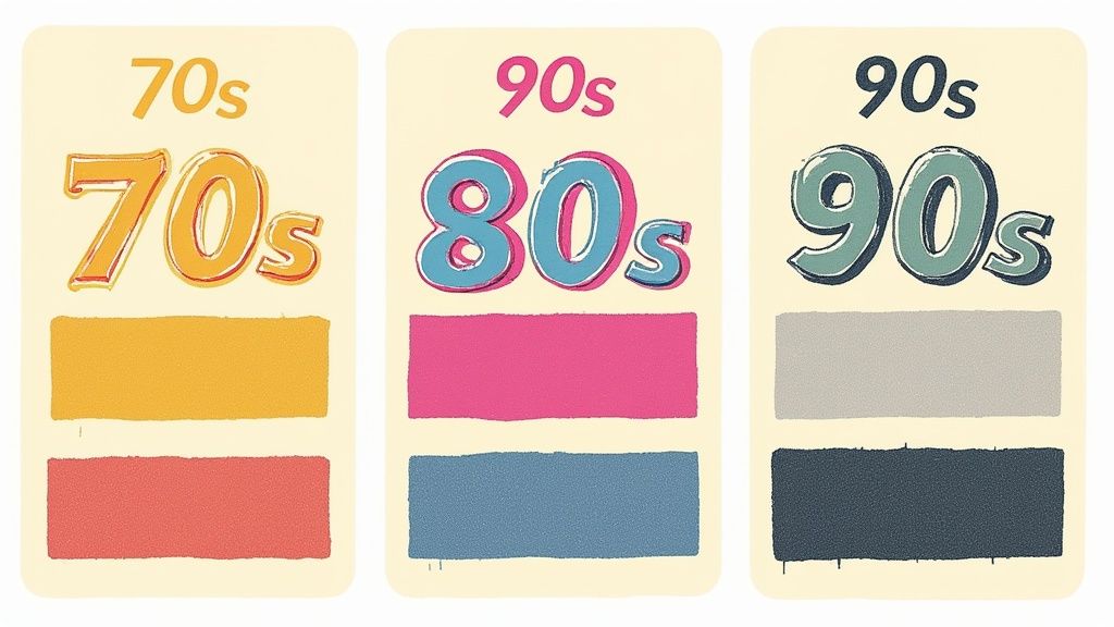
Retro Decade Design Cheat Sheet
To get you started, here’s a quick-reference guide to the key design elements that really define the most popular retro decades for t-shirts. Think of it as your field guide for time-traveling design.
| Decade | Key Typography Style | Dominant Color Palette | Common Graphic Motifs |
|---|---|---|---|
| 1970s | Bubbly, rounded, groovy serifs, psychedelic scripts. | Earth tones: avocado green, harvest gold, mustard yellow, burnt orange. | Rainbows, sunbursts, flowers, mushrooms, peace signs, bold stripes. |
| 1980s | Blocky, geometric sans-serifs, chrome effects, neon script fonts. | Electric neons: hot pink, electric blue, lime green, paired with black. | Geometric shapes (triangles, grids), tropical prints, arcade characters, sci-fi elements. |
| 1990s | Grunge textures, graffiti-style fonts, bold sans-serifs, rave flyers. | Muted jewel tones, faded pastels, high-contrast black & white. | Skulls, smiley faces, alien heads, bold logos, abstract patterns, gritty textures. |
Use this table to gut-check your designs. If you’re making a 90s tee, but it’s full of groovy bubbles and earth tones, you might be in the wrong decade!
The retro tee market is absolutely booming, and this chart below really drives home its impressive size and steady growth, especially with the explosion of online shopping.
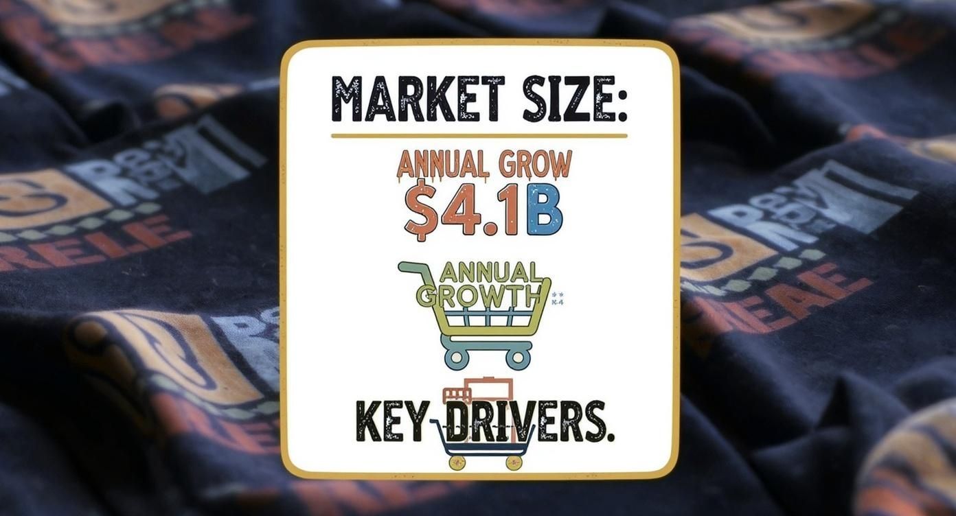
The numbers don't lie. This is a healthy, growing market with a massive consumer base just waiting for creative and authentic designs to connect with. Now you know where to start looking.
Choosing Colors and Fonts That Scream Vintage
Let’s be real. Nothing tanks a killer retro idea faster than a font that screams “Microsoft Word 2003.” Getting the colors and typography right is your express ticket to making a design feel like a genuine thrift store find, not a cheap knock-off.
Think of it this way: fonts and colors are the body language of your design. They communicate the vibe before anyone even reads the joke. You wouldn’t slap a laid-back 70s slogan in a pixelated 80s computer font, right? It just feels… wrong. Each decade had its own visual fingerprint, and tapping into that is crucial for creating authentic retro t shirt designs.
Nailing the 70s Look and Feel
The 70s were all about warm, earthy, and sometimes downright funky colors. This was the era of shag carpets and wood paneling, and the palettes reflected that. You want to think less about bright, primary colors and more about tones that feel organic and a little bit muted.
Your go-to 70s palette should include:
- Harvest Gold and Mustard Yellow: The undisputed kings of 70s color. Seriously.
- Avocado Green: You couldn't escape it back then, and you shouldn't ignore it now.
- Burnt Orange and Russet: Deep, warm tones that feel like a sunset over a music festival.
For typography, you’re hunting for fonts that feel optimistic, rounded, and groovy. Look for typefaces with bubbly, exaggerated curves or bold serifs that have some swagger. Think less about sharp edges and more about soft, friendly letterforms that look like they belong on a rock album cover.
Pro Tip: Don't be afraid to let your 70s fonts get a little chunky. The typography of this era was confident and unapologetic, often using thick lines and tight spacing to create a solid, impactful look.
Capturing That 80s Electric Energy
Then came the 80s, which threw the earthy 70s palette out the window and plugged directly into a neon sign. This decade was defined by loud, synthetic, and totally radical colors. It was the birth of MTV, arcade games, and Trapper Keepers, and the whole aesthetic was about high-energy, futuristic fun.
The 80s were drenched in electric hues:
- Hot Pink and Magenta: The brighter, the better.
- Electric Blue and Cyan: Think early computer graphics and sci-fi movie posters.
- Lime Green and Neon Yellow: Colors so bright you pretty much needed sunglasses.
Typography took a hard turn, too. Fonts got blocky, geometric, and often had a techy feel. We're talking pixelated arcade fonts, sharp-edged sans-serifs with chrome effects, and flashy script fonts that looked like they belonged on a sports car. These are perfect for a witty, self-aware novelty tee that pokes fun at the decade's over-the-top style.
The key here is using these elements to instantly signal the era. It's a visual shortcut that makes your funny t-shirts feel both nostalgic and clever right off the bat.
The Art of Making New Designs Look Old
Alright, let's get into the good stuff. You’ve picked your groovy fonts and far-out colors. But a perfectly clean, crisp graphic on a brand-new tee doesn’t exactly scream “I found this at a thrift store in 1988.”
It needs some history. It needs… grit.
This is where we get our hands dirty with the secret sauce of every great retro t shirt design: distressing. It's the art of making something new look like it’s survived a few decades of rock concerts, questionable laundry choices, and being stuffed in the back of a closet.
Let's be real, a bad distressing job can make a design look cheap and fake. But when you get it right? It elevates a cool idea into an authentic-feeling masterpiece.
Creating Authentic Wear and Tear
The key is to think about how a real shirt would age. Ink doesn’t just fade evenly; it cracks, flakes, and wears thin in certain spots. The collar, seams, and shoulders often show the most wear. You're trying to replicate that natural process, not just slap a generic “grunge” filter over the whole thing.
For those of you using design software like Photoshop or Procreate, this is where texture overlays and custom brushes become your best friends. These are pre-made textures of cracked ink, faded fabric, and subtle noise that you can layer right over your design.
Here’s how to approach it:
- Cracked Ink: Look for high-resolution textures of actual cracked paint or dried mud. When you layer these over your design and play with the blending modes (like ‘Screen’ or ‘Multiply’), you can create a realistic cracked-ink effect that looks like it’s been through the wringer.
- Faded Washes: Don’t just lower the opacity of your design—that looks lazy. Use a soft, textured eraser brush to gently fade out parts of the graphic. Focus on areas that would naturally get more sun or friction to give it that uneven, sun-bleached look.
- Print Imperfections: Old screen-printing methods weren't perfect. You can mimic this by slightly misaligning color layers or using a "halftone" texture to give it that classic, dot-printed appearance you see on vintage comics and tees.
This process isn't just about destroying your design; it's about adding character. Each scuff and crack tells a story and makes your funny t-shirts and novelty tees feel like they have a genuine past.
Matching the Distress to the Decade
Remember, the type of distressing you use should match the era you're trying to capture. A 70s design might have a soft, faded, sun-bleached vibe, while a 90s grunge-inspired tee would look better with heavy, cracked ink and a much grittier texture.
Getting these techniques down is a total game-changer. For a deeper dive into the whole creative process, from concept to final product, check out our complete guide on making your own graphic tees. It’s packed with actionable tips that will help you bring your ideas to life.
Ultimately, mastering these aging effects is what separates amateur designs from the pro-level retro t shirt designs that make people stop and say, “Whoa, where did you get that?”
Bringing It All Together with Layout and Humor
Alright, you’ve got your vintage fonts, a killer color palette, and you know how to make things look perfectly old. Awesome. But now you’re staring at all these cool ingredients and wondering how to actually bake the cake. This is where the magic happens—where composition and humor collide to create truly great retro t-shirt designs.
Let’s be real, a joke that doesn't land is just a bunch of words. The same goes for design. How you arrange your elements is just as important as the elements themselves. A messy, unbalanced design can make a hilarious one-liner feel awkward and confusing, which is the last thing you want on a funny t-shirt.
Mastering Classic Retro Layouts
Good news: you don't need to reinvent the wheel here. The most iconic retro tees almost always stick to a few tried-and-true layouts that just work. They feel familiar and give your humor the perfect stage to shine.
Some go-to compositions include:
- The Centered Chest Graphic: This is the undisputed champ of t-shirt design for a reason. It’s clean, bold, and puts your message front and center. It’s perfect for a punchy phrase or a single, impactful graphic that needs no introduction.
- The Distressed Logo Look: Think old-school band tees or defunct company logos from the 70s. This layout often uses arched text above and below a central icon, giving it an official, badge-like feel that’s just begging to be parodied.
- The Left Chest Print: For a more subtle, understated vibe, a small graphic or a bit of text over the heart is a total classic. It’s a great way to deliver a quiet joke that rewards people who are actually paying attention.
The layout is the setup, and the text is the punchline. You need to create a visual path that leads the eye straight to the joke, making it hit with maximum impact. A clean, classic composition ensures your wit doesn't get lost in a sea of design clutter.
Making the Joke Land
Now for the fun part. The real genius of a great retro tee is how the visual style actually makes the joke funnier. The clash of a vintage aesthetic with modern, relatable wit is pure comedy gold.
Think about how a bold, ridiculously confident 80s font can make a self-deprecating slogan like "Powered by Caffeine and Anxiety" hit even harder. The typography is all swagger and confidence, while the text is saying the exact opposite—that's the joke! This is how you inject that witty, cheeky personality that makes brands like Laugh Riot Tees so good.
Or, imagine a bubbly, optimistic 70s font on a sarcastic mom life shirt about surviving on dry shampoo and a toddler’s leftover Goldfish. The cheerful, groovy vibe makes the relatable struggle even more hilarious. It’s all about creating that perfect, ironic harmony between the look and the laugh.
Your Awesome Design Deserves an Awesome Tee
Alright, so you’ve done it. You’ve brought a witty, stylish, retro masterpiece into the world, and it's ready to go. Now what?
Let’s be real for a second. You can't just slap that work of art on some scratchy, boxy shirt that feels like you're wearing a cardboard box. That’s like putting a supercar engine in a rusty pickup truck. It just doesn't work. The quality of the tee itself is every bit as important as the killer retro t shirt design you poured hours into.
A bad shirt can make a great design feel cheap, uncomfortable, and totally unwearable.
Quality Makes the Difference
At Laugh Riot Tees, we get it. We’re just as obsessed with ridiculously comfy shirts as we are with hilarious designs. Every single one of our funny t-shirts is printed on super-soft, high-quality material that feels amazing right out of the box. No stiff, awkward fits here—just pure, breathable comfort.
The printing method also plays a huge part in how the final product looks and feels. A high-quality print ensures your vibrant colors and distressed textures look just as awesome on fabric as they do on your screen. If you're curious about the technical side, our guide on what is direct-to-garment printing breaks down how modern tech brings these designs to life.
Treat your brilliant design—or one of ours!—to the quality it deserves. After all, a shirt this good is meant to be your new favorite.
With new designs dropping every single week and free shipping on every order, your wardrobe will never get stale again. You’ve earned it.
Go on, find your new favorite shirt now.
Got Questions About Retro T-Shirt Design? We've Got Answers.
Jumping into the world of retro design can feel like you've time-traveled without a map. We get it. Here are some of the most common questions we see, with the straight-up answers you need to get going.
How Much Are Retro Designs Worth, Anyway?
Let's cut to the chase: nostalgia sells. Big time. The global custom t-shirt printing market is on track to blow past $10 billion in 2025, and a massive chunk of that is driven by people wanting that old-school cool.
Designs that nail that throwback vibe aren't just a fleeting trend; they're a serious market force. People want to wear their memories, and a great retro tee lets them do just that.
Can I Just Slap a Vintage Logo on a Shirt?
This is a big one, and the answer is a hard no. Using logos from old bands, movies, or brands without permission is the fastest way to get a scary letter from a lawyer.
The goal isn't to copy; it's to be inspired. Take the feel of a 70s rock poster or the color palette of an 80s video game and spin it into something completely new and original.
The best retro t shirt designs remix the past, they don't rip it off. Think of it as a creative homage—you’re capturing the spirit of an era, not stealing its intellectual property.
How Do I Keep My Retro Shirts from Fading?
So you've designed (or bought) the perfect vintage-style tee and want it to last. Proper care is everything.
The golden rule? Turn your shirt inside out and wash it in cold water. And whatever you do, avoid the high-heat setting on your dryer—it's the mortal enemy of graphic prints. For the full rundown on keeping your tees looking fresh, check out our guide on how to wash graphic tees. It’s packed with simple tips to preserve your favorite tees for years to come.
Ready to skip the design work and get right to the good stuff? At Laugh Riot Tees, we live for killer designs on ridiculously soft tees.